Incorporating colour psychology into your home design
Colours have a wonderful power to sway our emotions, create an ambience, and affect our mood. Every colour, from vibrant reds to soothing blues, has a different psychological effect. You can use the power of colour to design a harmonious and welcoming home by understanding the basic principles of colour psychology.
Let’s explore colour psychology and how you might apply it to your interior design.
Colours have unique meanings and associations that can elicit particular feelings and reactions. Consider the following basic elements of colour psychology:
Symbolic meanings can be connected with colours in different cultures and societies. For instance, red symbolises passion and energy in the West while representing luck and success in some Eastern cultures.
Every room in your home serves a unique purpose, and the right choice of colours can enhance its intended function. Consider these colour recommendations for various rooms:
Soft blues, muted greens, and lavender hues create a serene and peaceful atmosphere. Avoid bright, stimulating colours in the bedroom to promote better sleep.
Yellow is an excellent choice of colour for a home office or study room since it encourages creativity and concentration. Red accents can boost vigour and improve attention to detail.
Warm neutrals, such as beige and light brown, elicit feelings of relaxation and comfort. The use of earthy tones, such as rich oranges and warm greens, can create a cosy and inviting ambience.
Warm and vibrant colours, such as red, orange, and yellow, can stimulate the appetite and create a lively kitchen environment. Lighter shades of green or blue can also be effective in creating a fresh and clean atmosphere.
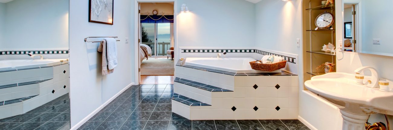
Soft pastels, such as pale blues and gentle greens, can be used to create a tranquil and soothing bathroom atmosphere. White or light grey can also provide a feeling of cleanliness and freshness.
It is essential to choose the proper colour combinations in order to create a visually appealing and harmonious space. Consider the following colour harmonies:
Complementary colours
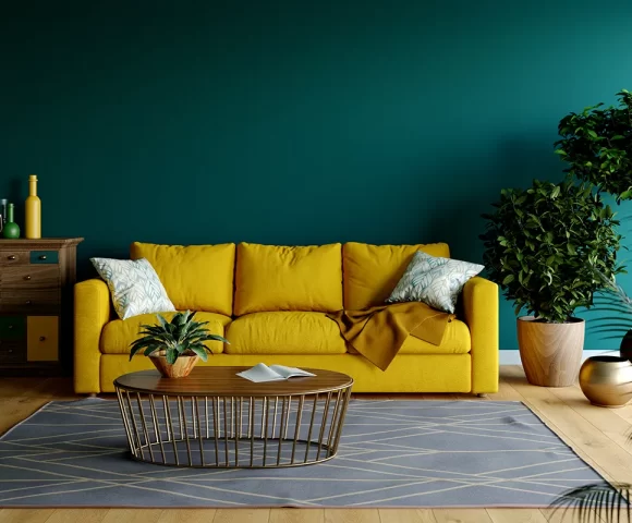
On the colour wheel, complementary colours are opposite one another, such as blue and orange or red and green. This combination creates a striking contrast and can be used to draw attention to specific elements of a room.
Analogous colours
Analogous colours are adjacent on the colour wheel, like blue and green or yellow and orange. These colour schemes provide a sense of harmony and can be used to create a cohesive look throughout a space.
Triadic Harmony
Yellow, blue, and red are examples of triadic colours that are evenly spaced on the colour wheel. This approach allows a well-balanced combination of colours and provides aesthetic value.
Monochromatic elegance
Monochromatic colour schemes consist of varying shades, tints, and tones of a single colour. This creates a refined and uniform look, allowing for variations in intensity and depth.
When choosing a colour scheme for your home, remember to include vibrant accents that add personality and create visual interest. Consider these ideas:
Strategic colour pops
Use furniture, artwork, or decorative items with bold colours to add visual interest to a room. A vibrant red chair or a colourful abstract painting, for instance, can serve as a captivating focal point.
Artwork and wall decor
Decorate your walls with colourful artwork or photographs to add splashes of colour to your space. Choose elements that complement your overall colour scheme to preserve harmony.
Textiles and soft furnishings
Introduce vibrant pillows, throws, curtains, and rugs to add texture and warmth. These soft furnishings allow simple colour experimentation and can be replaced as desired.
Natural elements
Include indoor plants and fresh flowers to bring the vibrant hues of nature into your home. Not only do they add a touch of colour, but they also enhance air quality and create a calming atmosphere.
By incorporating colour psychology into your home design, it is possible to create spaces that are aesthetically pleasing and elicit the desired emotions and moods. To personalise your space, remember to consider the purpose of each room, choose appropriate colour combinations, and accent with bursts of colour. Experiment, have fun, and let the power of colour transform your home into a welcoming and harmonious sanctuary.

No comments.